Motion Design
Animated Brand Campaign
|
Brief: Research a brand and develop a motion campaign package that reflects the brand’s goals.
Deliverables: 5s looping logo 10s looping poster 15s social media spot 25s traditional promo video |
The Center for Humane Technology is a nonprofit organization that is driven to educate technologists and promote humane digital practices. I chose to design a conceptual awareness campaign about "Human Downgrading" after researching design ethics for a previous project. The negative effects of technology on society are controlled by a small number of executives. The more we talk about this, the more we can change. This message struck me, and it's an important one that I wanted to amplify.
|
|
Research. I had recently done research on ethics in social media and came across the Center for Humane Technology while writing my thesis. Their mission and lectures were compelling to me. One of their main points was that “human downgrading” wasn’t inevitable and that we have the power to keep big tech companies accountable by talking about the issues of the “extractive attention economy” and putting pressure on them.
|
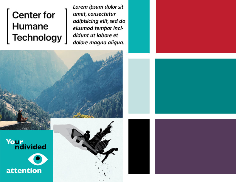
The website and brand at the time of this project was not very developed. I decided it was a great opportunity to expand their brand language and emphasize a human touch with the visuals of the campaign.
Pictured: Moodboard of previous brand visuals.
|
|
Determining Brand Campaign Message. I broke down CHT’s mission and brand goals to narrow in a message for this campaign. They primarily spoke at tech conferences, but I decided the goal of this campaign would be to raise awareness in the general public.
I had to boil down a lot of dense information into bite-size pieces that informed the viewer without discouraging them. |
It was tricky to strike a tonal balance between doom and hope, to establish the problem and present a call to action.
|
|
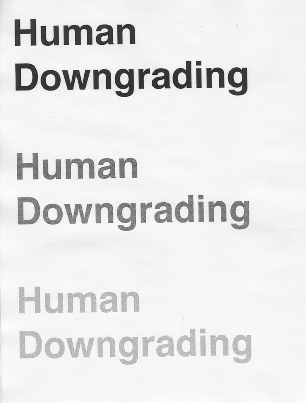
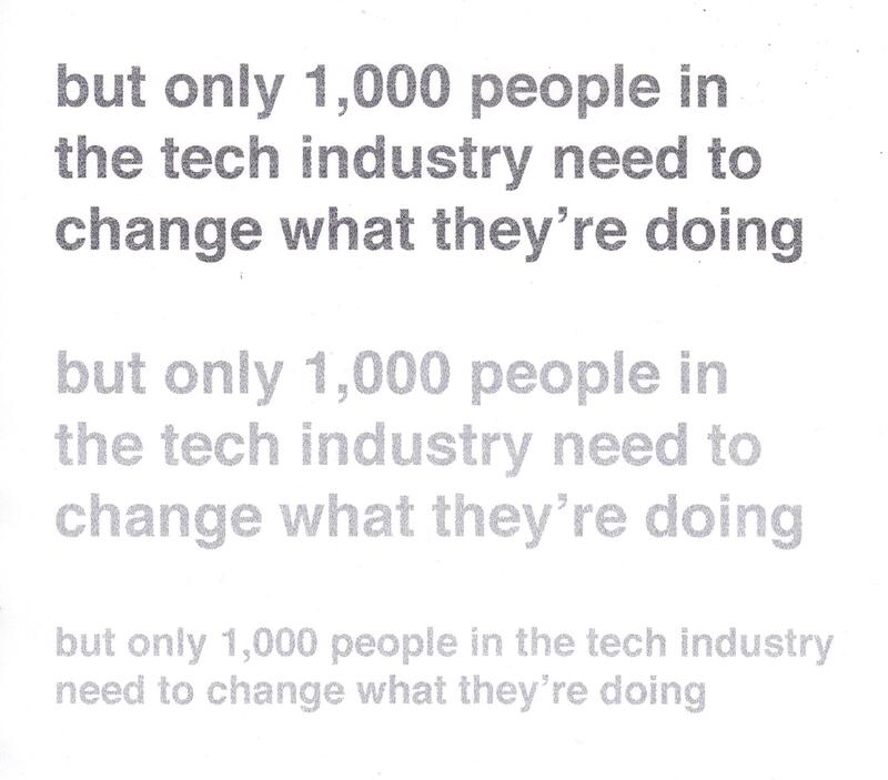
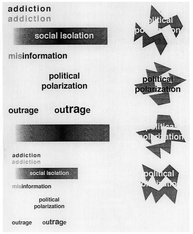
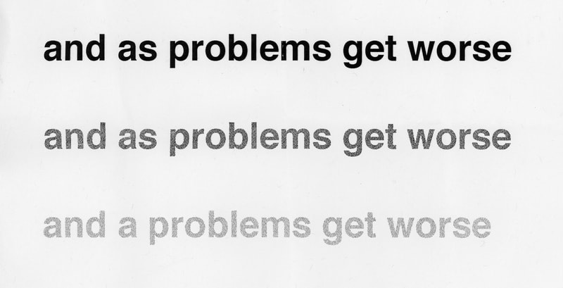
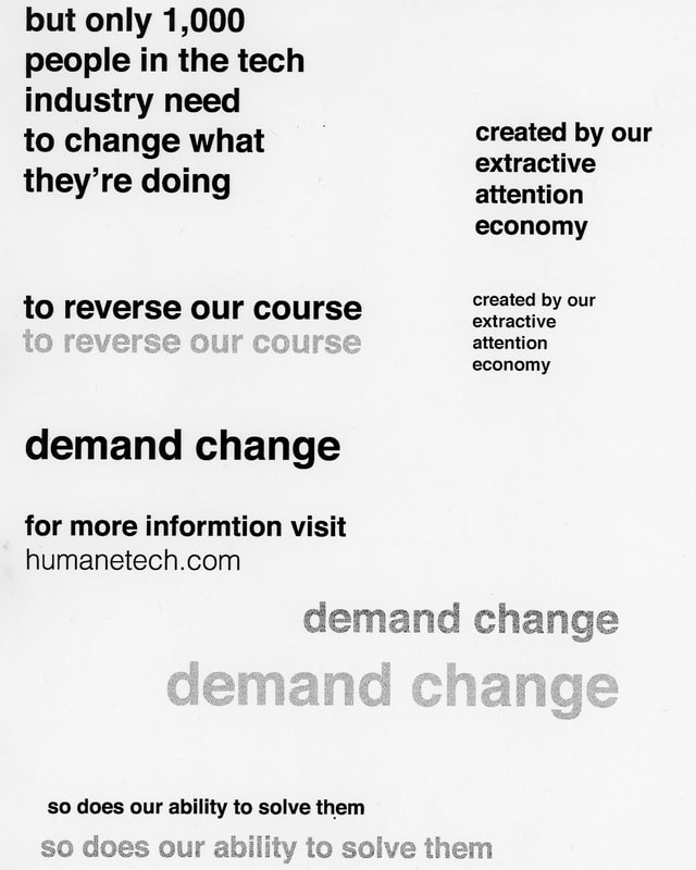
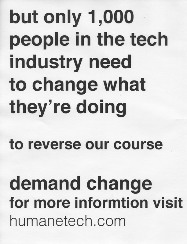
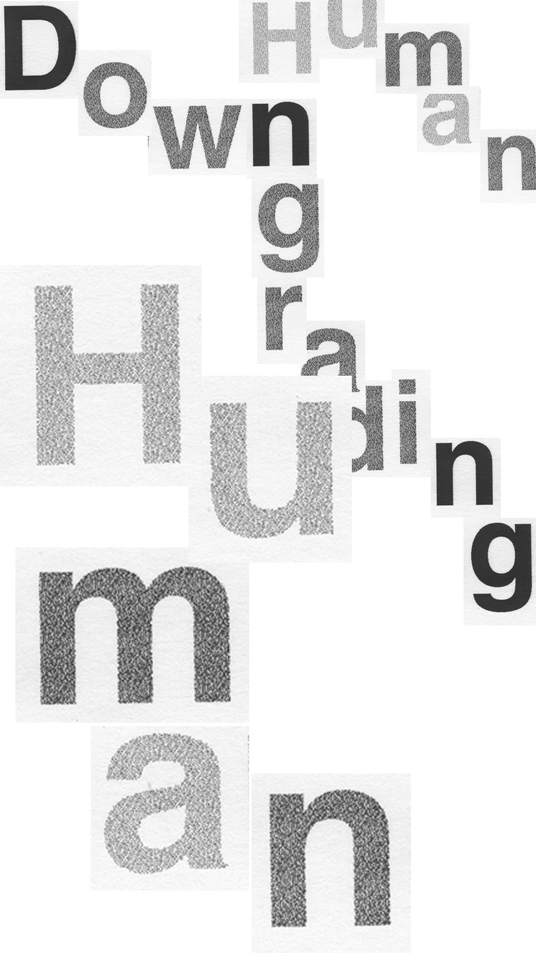
Handmade Assets. All of the type in my animated poster, social media spot, and promo video were printed, scanned, re-printed, and scanned again in order to create a more "downgraded" feel with a human touch.
|
I wanted every piece of the video to be analog.
|
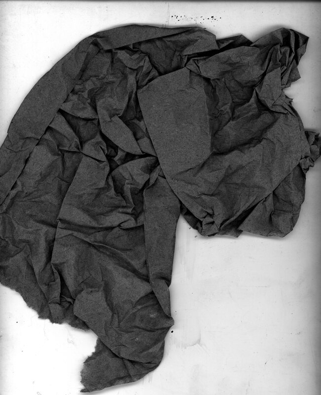
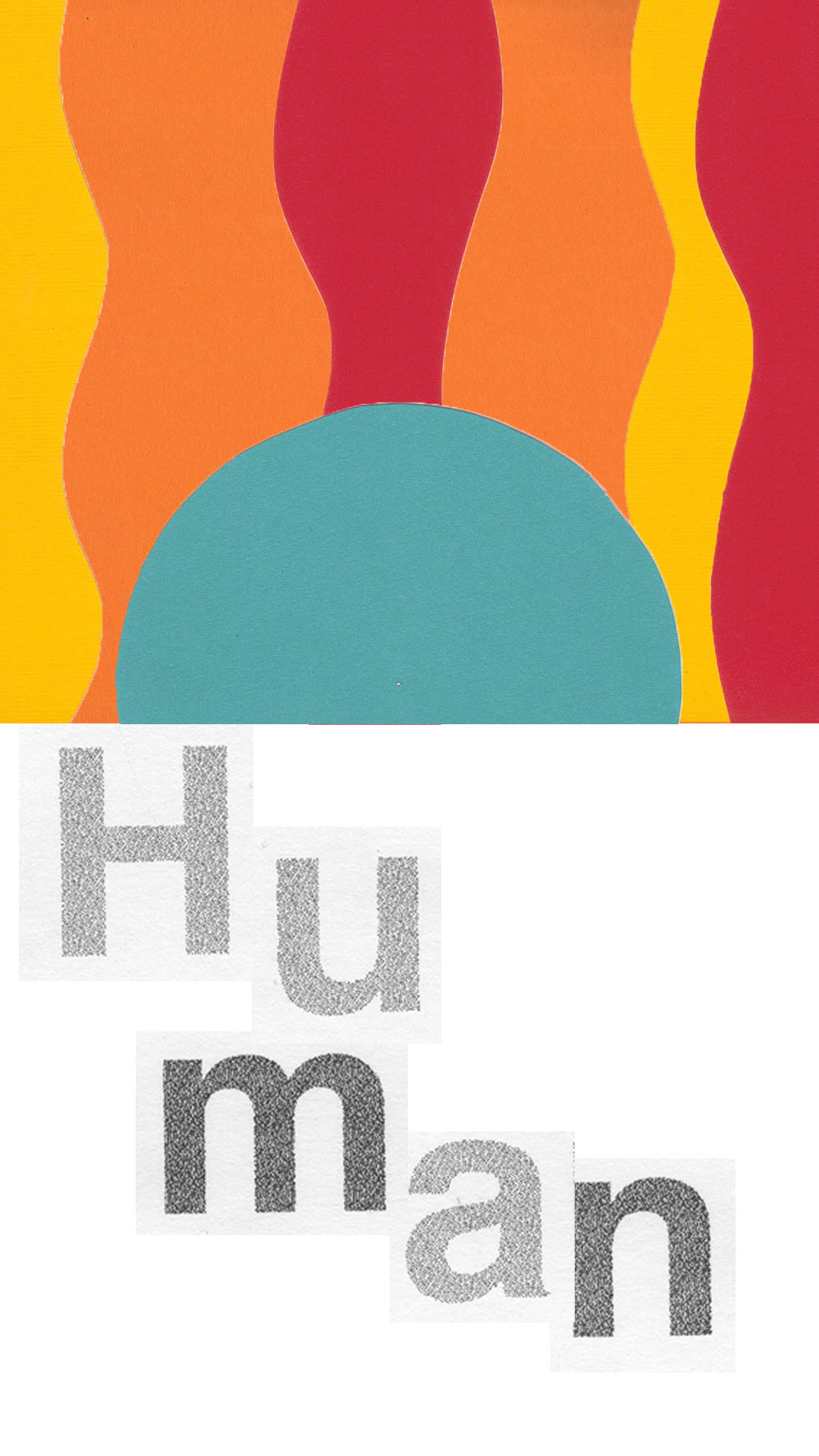
I sourced paper with various weights and textures, cut out shapes, crumpled, and scanned pieces before setting everything to motion in After Effects.
|
|
Early Styleframes. Early styleframes were created as a digital collage for vertical and horizontal dimensions. I experimented with movement and layering type with textures.
|
Sound and Music. A huge factor in setting the tone was music and sound effects. After scanning in paper assets for the visuals and experimenting with the video’s structure, I carefully pieced together sound collages and an instrumental track with a strong beat. I wanted to achieve a sound that I felt was pensive, serious, and hopeful at the same time. The collage technique appropriately brought together the ideas of the visual paper collage and soundbites of technology for the Center of Humane Technology.

